Monday, 25 April 2011

Evaluation Activity 4: How did you use new media technologies in the construction and research, planning and evaluation stages?

Throughout the construction of all three of our ancillary tasks (teaser trailer, film poster and magazine front cover) we applied the use of Digital Technologies shown below.

Dave with the Camera and Tripod we used:


Boom


Adobe Premiere


We used Adobe Premiere to edit our teaser trailer. This allowed us to identify the process of selecting and preparing shots and scenes using the effects that the software comes with to emphasise what we were trying to portray.


Adobe Photoshop


Adobe Illustrator


The use of the above programs; Adobe Photoshop and Adobe Illustrator, allowed us to manipulate the images for the magazine cover and poster to enhance the emotion and overall appearance that we wished to present.


Slideshare


We used 'Slideshare' early on in our Research and Planning stages to involve and combine different interactive IT skills.

Youtube


We have used 'Youtube' throughout our foundation and advanced portfolio to both gain audience feedback and use as a free movie uploader, we have also been able to improve our knowledge of teaser trailer elements by viewing other uploaded 'Teaser trailers'.


Blogger


Blogger is a free web-blog publishing tool from Google, used for sharing text, photos and videos. We have used this throughout our foundation and advanced portfolio to publish our work from research and planning to our final edited teaser trailer, teaser posters and film magazine front covers. We have enabled access to anyone worldwide to view and follow our blogs allowing us to recieve any positive or negative feedback via email.


Sunday, 17 April 2011

Evaluation Activity 3: What have you learned from your audience feedback?

Our audience feedback needs editing down in length as the upload limit of YouTube is 15 minutes and our feedback is 18 minutes.


Our audience feedback shown in the videos above has enabled us to hear other peoples opinions on all three of our ancillary tasks, both negative and positive. This allows us to see if we have achieved our intentions and to what extent. It also helps to realise areas that we could improve on, and therefore re look at certain aspects and adjust and edit them, to improve our overall product.

Below shows the comments I have taken from the audience feedback, the vast amount of points displays that this was very beneficial.

Positive


  • Good use of time stretch - manipulation of pace

  • Enigma - making the audience wanting to know more

  • Realistic

  • Pacey

  • Nice Length

Factors to possibly re-visit


  • Punch in face - see if the transition of face to blood trim down

  • Dialogue/ Voice over

Improvements


  • Wider audience

Magazine


  • Good choice of image (different from trailer)

  • Matches colour scheme

  • Right choice of magazine

  • Font matches teaser trailer

Poster


  • Good composition

  • Black and White

  • Portrays sub-urbs well


YouTube Feedback

In the below image you can see a print screen of our official 'Teaser Trailer' posted online via 'YouTube' I have imported the screen shot into Microsoft word to allow me to annotate the image and clearly showing the YouTube feed back success.


Facebook Feedback

Below is an image of a print screen when we first posted our Media Coursework onto a social networking site; Facebook. This seemed the most logical way of getting as much feed back as possible. All of our friends were able to comment and or like the post, depending on what they thought of it. There was a fairly positive outcome as shown below, with a variety of comments and a healthy amount of likes.


Blogger Feedback

This image below illustrates the international audience views of my G324 A2 Media Blog.

Evaluation Activity 2: How effective is the combination of your main product and ancillary texts?


Above is an annotated version of our teaser trailer displaying our thought process during the creation of our trailer. The colours throughout the trailer are generally quite dark, this dark atmosphere is also displayed well in both the poster and the magazine cover. The images used on the magazine cover and the poster are also of a very similar setting to where the scenes of our trailer were set, so this urban theme runs throughout, representing our genre well. In both our ancillary texts we have used a figure in the images, as we have used actors in our trailer, suggesting a mysterious character in all three, yet none of them reveal much about the character, leaving the viewer intrigued. We have also used similar texts for all, creating a relationship between the three.

We have created a colour scheme to run throughout all of our pieces, with the dark atmosphere suggested through the black and white teaser poster. We have also chosen similar settings and characters to link the magazine and poster to the narrative of the trailer. Therefore, they work well and are an effective combination, with the magazine and poster acting as a promotion/advertising technique for the trailer.

Wednesday, 30 March 2011

Evaluation Activity 1: In what ways does your media product use, develop or challenge forms and conventions of real media products?


1. This shot suggests the genre that we were trying to convey well, particularly due to the blue police lights in the background of the scene, hinting at crime and violence. This shot also portrays the urban location we used to represnt the contemporary city atmosphere of the drama. The movement of cars and flicker of street lights suggests action and suspense as the audience are waiting for something to occur. It also creates suspicion of what is going on in the background of the shot, as all the action of the shot including the positioning of the police lights are in the distance.

2. We used time manipulation as a common special effect in our trailer, as it complimented and enhaced the fast-paced action scenes throughout. This shot also represnts our choice of location well. We chose this city location as it has a busy, fast moving atmosphere, creating the sense of action, which works well with our choice of 'urban-drama' genre. The city lights and cars create the sense of movement and liveliness, yet the angle that the shot was set from creates a contrast in mood and atmosphere, as it is far more isolated. Similarly some of our other locations were effective due to this contrast of a vast, lively atmosphere, with the irony of the shere sense of isolation within a busy city location such as this. The setting was generally at night for all scenes of the trailer, creating a dark, mysterious atmosphere, also reflectiing the use of 'Night' in 'Nightmare' from the title.

3. I chose this shot to display how our characters were introduced throughout the trailer. The shot shown is of one of the main characters. It its a close-up shot of the face, which also became a freeze-frame allowing the audience to familiarise themselves with the character, and for the character to be recognisable when the audience watch the actual film, but this is all the trailer reveals about the character, creating a large amount of ambiguity leaving the audience of the trailer interested.

4. This shot shows the font that we used throughout the trailer; 'Poplar STD'. This is a clear bold font which we chose to have in white, creating a contrast with the dark background. As the font is large and bold it leaves a powerful effect on the audience and allows them to read it quickly and easily. I feel this powerful, bold font represents the intense storyline well and compliments the fast paced shots of our trailer. All letters of the title have been put in capitals except the 'i' of 'NiGHTMARE', this gives a more contemporary, unique look to the title and draws attention to the word 'Nightmare'.

5. We used a variation of low and high angled shots to create the sense of power and weakness, reflecting the characters emotions. The shot shown here creates the feeling of being watched or spied on, also creating a sense of secretivity. Generally the camerawork was handheld to create a more realistic approach, yet we did use a tripod for the main introductory shots of setting and location. We aimed to use the most interesting compositions as possible for our shots, as well as to create smooth transitions by tightly editing the scenes, and creating a fast-paced, smooth flowing teaser trailer to attract our target audience.

6. The title of our film is shown as the second to last shot of the trailer, therefore it is familiar in the audience minds and they will not forget the title as the trailer continues. This is also in 'Poplar STD' font, keeping the same theme throughout, yet as the title is the only piece of information in the shot it allowed us to make the font a larger size which is therefore more powerful and eyecatching, taking up the whole of the frame. The plain black background allows nothing to draw the audiences attention away from the title. The variation of the size of the font between shots makes the overall appearance of the trailer more interesting to the audience.

7. It was not necessary for us to use many props within our trailer as we used the elements of our chosen location that were naturally there to emphasise realism. We did use a car and fake blood as the most obvious props within the main acting scenes and therefore needed control over them. We used items of clothing such as hooded jumpers, tracksuit bottoms, jeans and trainers for our characters to wear. This helps to create a contemporary appearance of the characters and the overall film, as well as representing modern clothing today and the appearance of a late teen stereotype, allowing our target audience to relate to the characters.

8. The trailer gives a good sense of the genre and atmosphere of the film and hints at the storyline, yet reveals very little about the way the film flows, or the main events. This is beneficial as it creates interest and curiousity within the audience. The trailer is fairly short but manages to give away enough about the genre and mood of the film to attract its target audience, but they would need to see the film before understanding the plot.

9. Facebook and twitter are large international social networking sites, commonly used for advertising and viral marketing. Therefore, having an available link of the film on these sites makes it available for further research of the film which is easily accessable to public and constantly advertises the film to the target audience of younger people.

Final Teaser Poster


Film Title: Sub Urban Nightmare

Tagline: Roll with us or get rolled over

Website: www.suburbannightmarethemovie.co.uk

Annotated Final Poster


PROCESSES

Adding text:


Adding background image:


Adding a tagline:


Playing with the contrast:

Sunday, 27 March 2011

Research & Planning - To Do List

Research:


  • Soundtrack research (non copyright music)


  • Costume and location research


  • Actors and props photos


  • Audience Research (typical audience member and similar films)


  • Upload YouTube videos of teaser trailers and titles analysed in detail


  • Upload YouTube videos of similar genre films analysed in detail


  • Institution research


  • Certificate research


  • Font research for magazine/ poster etc


  • Film magazines researched and analysed


  • Teaser posters researched and analysed


Planning:


  • Own film idea brainstorm


  • Own film treatment


  • Shot lists


  • Questionnaire (and feedback)


  • Photos etc of filming


  • Diary of filming/editing etc with photos and screengrabs


  • Mood board


  • Storyboard - animatic


  • Script


  • Practice titles created and uploaded

Editing

Firstly we had to take the footage off the camera and import it to the computer, to allow us to edit it.
Below are the screenshots I have taken from the editing process:

Freeze Frame

Adding Text


Time Stretch

These images display the processes we went through to manipulate our film, using various different techniques to achieve the desired affects.

Sunday, 20 March 2011

Research: Suitable Fonts

After researching several Adobe 'urban' fonts we came to the conclusion that Poplar STD was the clearest 'urban' font we could find. This minimises the chances of our audience mis-reading any taglines or the film titles, allowing them to research the film after the teaser trailer viewing sufficiently.


Wednesday, 16 March 2011

Planning: Day 2 of Filming

After the last filming experience we understood that quite a bit more of filming was neccessary, so once again we got cracking. Similarly we started in the late evening 8pm-ish and travelled fortunately by car on a freezing cold spring evening, fortunately our characters were wrapped up in hoodies looking thuggish keeping warm.

Throughout the evening we were slowly starting to struggle to find new exciting places and creative shots to take, we were getting colder and colder, our motivation was decreasing and then all of a sudden Tom noticed a graffiti covered alley way, the ideal location for a mugging of some sort.

Once again we were filming until the early hours of the following morning, however things were looking up. Looking over the footage we took previously, combined we had a healthy variety of shots suitable for our 'teaser trailer'.

Now for the time consuming stage of editing using Adobe Premiere Elements on our 10 year old slow school computers.

Saturday, 12 March 2011

Planning: Day 1 of Filming

Today we finally managed to arrange a time that we were all free, ended up being 9pm at night onwards, which fortunately for us was a suitable time to be filming. The streets were quiet and eary, street lights created threatening shadows and most importantly we didn't bump into anyone we knew. We started off by driving all the way up the road and realising we had forgotten the video camera, good start eh?

Then onwards we were on a roll, we got our thinking caps on and had an overflowing street knowledge joined with shot creativity, unfortunately our story board we had drawn up early in the week had gone out the window, although a vague relationship between the shots were still noticable.

After travelling from street corner to street corner, town to town, high shot to low shot, establishing to close ups. Our filming experience had finally come to an end in the early hours of the next morning, we were fairly happy with what we had got done and thought we had a good chunk of filming to get cracking with the next day at school, however we were in for a big suprise.

Thursday, 10 March 2011

Editing Techniques Research

I came across this sponsership video for 'Legacy' skateboarding and was very impressed with the style of editing and the contrast of fading in and out. The video will most likely influence our edited shot transitions to enhance an effective powerful teaser trailer.

Legacy from legacy on Vimeo.

Wednesday, 2 March 2011

Film Magazine Research


I decided to research Sight & Sound Film magazine as my magazine front cover, a few reasons being:

It's a British magazine and with my film being a British production, it was highly relevant.
It has an online presence as much as the physical issue.
The online presence includes a website and forum. Sight & Sound is also on Twitter and Facebook.
It features many high concept films from different genres.

Wednesday, 9 February 2011

Research: Film Magazine Front Cover; Empire


Today I analysed the front cover of 'Empire' film magazine to help give me an insight into effective film magazines and which type we should try and aim for. It also allowed me to view the typical elements that film magazines contain. This helps us design a suitable, effective, and realistic magazine front cover.

Wednesday, 26 January 2011

Film Poster - Practice

Below is the first image i started with one of our possible location shots.


I then cut 'me' the figure on the right out of the background using photoshop and the magic background eraser.


Below is an image of the developing stages of my poster.


This is my final developed poster screenshot.

Monday, 24 January 2011

Research: Film Teaser Poster Analysis

Below is a powerpoint of two film posters which i've analysed then uploaded via 'slideshare' to help broaden my knowledge of the traditional elements of film posters and the enigmatic features which they have and how they've created it.

Thursday, 20 January 2011

Research: Intertitles; Anuvahood


1. Institution Introduction

2. Meet Kenneth

3. He thinks he's got the moves

4. He thinks he's got swagger

5. Now this spring

6. It's time to get rich

7. Or cry trying

8. This ain't just any hood

9. Its anuvahood

10. A film by

11. Adam Deacon


In the teaser trailer of 'Anuvahood' 11 intertitles were used saying the above information. As we are currently in the progress of finishing our editing, intertitles are something that we need to think about, therefore this information will help influence and inspire us, particularly as the film genres are similar.

Saturday, 15 January 2011

Planning: Shot List

-titles "next summer"
-close up shot of Dave's face when he/me turns his head watching max.
-long shot of group of youths
-mid shot of someone looking up breathing out smoke....
-establishing shot of a rave
-mid shot of people grinding.
-titles directed by .....
-long shot of police car driving past camera movement
-panning following the car.
-titles produced by..
-close up of character with bruised face out of breathe
-titles from the director of .... (previous films)
-low angle POV shot of someone being punched
-titles from the makers of ....
-Close up of a characters face battered and brusied with blunt look on there face.
-close up shot on gun being pointed
-black screen sound of gun
-titles film name
-titles website..

Monday, 10 January 2011

Research: Script

Below is a rough idea of how we expect and hope our script to turn out in our teaser trailer. We use little dialogue as a technique for adding tension and a sense of mystery behind the scenes that we show, although non-diegetic sound will be used to highlight any states of emergency and action.

The script was created by following through the animatic shot lists one by one and filling in where it would be neccessary to have dialogue.

Shot 4: (This winter..) - We are currently undecided on whether we will get a character to say "This winter" or leave the silence to add suspense.

Shot 5: (fight scene) - Moans and groans of the fight will be classed as standard diegetic on scene noise.

Shot 7: (Their story is told..) - Again we are not sure whether to include a voice over of a character saying "Their story is told", if we do decide on this the other titles will have a voice over accompanying them too.

Shot 9: (Result of fight - Close up) - Possibly diegetic noise may be said by the character as an emphasis on emotion and the state in which they are, but no specific dialogue.

Shot 12: (Confrontation of character) - The character shouts aggressively "What?" as a bold challenge and to highlight a typical aggressive attitude.

Research: Props

Props for the scenes:

Below is a rough idea of what props we will need throughout our teaser trailer, it is important that we plan this aspect to create undeniable realism and a professional effect.

The (–) mean that props are not needed for this shot.

Shot 1: - (everyday tower block view no added props needed)

Shot 2: - (everyday street view of a police car, no added props needed)

Shot 3: A cigerette will be needed to add emphasis on a rebellious character introduction.

Shot 4: - (titles)

Shot 5: - (a standard mock fist fight with no weapons)

Shot 6: A spray of fake blood will be used to create the remains of a realistic fight splattered up the wall

Shot 7: - (titles)

Shot 8: Fake blood and Make up will be used to emphasis the rough attack on the character

Shot 9: A car will be used to race by (either mine or Daves) to highlight the rebellious act

Shot 10: A cigerette will be used again to be stamped out to illustrate a state of anger or terror

Shot 11: -

Shot 12: A replica BB gun will be used for this shot to add emphasis on the violent outburst

Shot 13: - (Titles)

Shot 14: - (Titles)

Shot 15: - (Titles)

This is the fake blood gel we will use:

Max - Costume Analysis

This is a screen shot image of me and the clothing I was wearing on the night of filming. I have analysed the image and highlighted the reasons for wearing the particular items of clothing.

Research: Actors/Characters

(me)Max - (photo of Me dressed as the character)

Dave - (photo of Dave dressed as the character)

Tom - (photo of Tom dressed as the character)

Research: Costume

Sunday, 9 January 2011

Planning: Storyboard Presentation

Planning: Scanned Storyboard

1-5


6-10


11-15

Planning: Mood board; Possible Locations


Above is a selection of images I photographed from a local Estate called Water fields, this is one of our possible location settings to help illustrate our urban drama genre.
The blocks of flats highlights a less wealthy more densely populated area typically stereotyped to thrive with drugs, violence and crime, unfortunately this is a negative portrayal of the area but considerably effective in our teaser trailer to illustrate a clear image of the diverse lifestyles.

Research: Location; Leatherhead

Monday, 6 December 2010

Research: Soundtrack; non copyright

Today we discovered a non copyright music website called 'FreePlay Music'. After spending hours searching through the majority of the appropriate music it had to offer, we finalised it down to 6 of our favourite songs. (shown below)

It would be best and most beneficial mark scheme way to either create and produce our own song using fruity loops 8 software I have on my computer at home, or find an appropriate non-copyright piece of music to fit in to our urban drama.


After looking through the urban genres: pop, hip-hop, rap and drum 'n' bass we came to the conclusion that drum 'n' bass will be most appropriate for our youthful fast paced gritty urban drama.

Thursday, 4 November 2010

Research: Soundtrack; Copyright

This music video is both the kind of music and scene we wish to portray in our teaser trailer. Fast paced, exhilarating and exciting to keep the audience as a younger age group on edge and not bored.

Research: Soundtrack; Copyright

Maverick Sabre - Sometimes


I believe this music video, portrays a suitable negative light on reminicing better days and how quoted in the lyrics 'sometimes we just wana go back to where we came from'.

Research: Sound FX; Non-Copyright

http://www.soundsnap.com

This is a great website for getting odd sound effects with no copyright issues, we will most likely make reference to this throughout our teaser trailer development.

Research: Sound FX; Software

Sound FX will be a major influence in our teaser trailer as they help enhance any emotion we wish to portray through our shots and scenes.

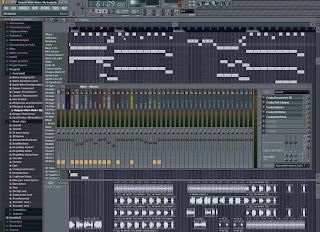
We are going to try and make a few ourselves with a program called Fruity Loops 8 music software.

Below is the software package I have personally at home, this allows us to create and produce our own music. It also includes a fully featured sequencer with MIDI, VST/VSTi and DXi support, which is fortunately compatible with the Adobe Premiere sound software which we will edit our 'teaser trailer' on.


The screenshots below show the process of the drum 'n' bass mix I've started producing..


Research: Soundtrack; Copyright

Ed Sheeran - The A Team

I like this song because it has a consistent pace with a steady acoustic beat which illustrates a chilled lifestyle, although in the lyrics of this song they speak a story of 'a better life' I believe we should consider a musical story influence on our teaser trailer because It really subconsiously reflects an emotional attachment with the audience and the storyline.

Little Dee ft Mr Blu - Rain

This song starts with a soothing choir melody with the words 'patiently waiting to get my foot in doors' rapped over the top. This lyric portrays an emotional scene about making movements and making something of nothing which Is the kind of scene which would possibly be addressed within our ubran drama teaser trailer. The pace in this song is also quite steady and consistent with a contrast of melody and drum beats to show a contrast of lifestyles within our teaser trailer.

Wednesday, 3 November 2010

Research: Inspirational Soundtrack; Copyright


I like this paticular song due to the vast contrast in beats mixing with a grime MC rapping, to portray a street lifestyle and emotion in our teaser trailer, this song is constantly fast flowing building tension and excitement, able in getting the audience pumped for the immediate drop of a cliff hanger, officially 'teasing' the audience. Whilst being able to portray the genre of our teaser well, appealing purely for teenagers/young adults.

Research: Sound FX; Non-Copyright


The heart beat style sound is useful in enhancing an emotional attachment with the audience and the scenes shown, also allowing the scene to be effected distinctly depending on the speed of the heart, portraying a fast or slow scene, enhancing tension constantly.

Tuesday, 2 November 2010

Teaser Trailer - Must Do's

Below is a mind map of all of the components I must consider when producing our teaser trailer to gain maximum marks.

Thursday, 28 October 2010

Research: Certification

We have chosen to research both the 12/12A to 15 gap, we know that this age gap is most beneficial to research due to our healthy film knowledge of being A level media students. Below is some information taken from the http://www.bbfc.co.uk (British Board of Film Classification) we thought it would be worth our while to look into both of the certification boundaries to allow us to decide firmly on a suitable age certification.

Suitable for 12 years and over


’12A’/’12′

Exactly the same criteria are used to classify works at ‘12A’ and ‘12’. These categories are awarded where the material is suitable, in general, only for those aged 12 and over. Works classified at these categories may upset children under 12 or contain material which many parents will find unsuitable for them.

The ‘12A’ category exists only for cinema films. No one younger than 12 may see a ‘12A’ film in a cinema unless accompanied by an adult, and films classified ‘12A’ are not recommended for a child below 12. An adult may take a younger child if, in their judgement, the film is suitable for that particular child. In such circumstances, responsibility for allowing a child under 12 to view lies with the accompanying adult.

The ‘12’ category exists only for video works. No one younger than 12 may rent or buy a ‘12’ rated video work.

Discrimination

Discriminatory language or behaviour must not be endorsed by the work as a whole. Aggressive discriminatory language or behaviour is unlikely to be acceptable unless clearly condemned.

Drugs

Any misuse of drugs must be infrequent and should not be glamorised or give instructional detail.

Horror

Moderate physical and psychological threat may be permitted, provided disturbing sequences are not frequent or sustained.

Imitable behaviour

Dangerous behaviour (for example, hanging, suicide and self-harming) should not dwell on detail which could be copied, or appear pain or harm free. Easily accessible weapons should not be glamorised.

Language

Moderate language is allowed. The use of strong language (for example, ‘fuck’) must be infrequent.

Nudity

Nudity is allowed, but in a sexual context must be brief and discreet.

Sex

Sexual activity may be briefly and discreetly portrayed. Sex references should not go beyond what is suitable for young teenagers. Frequent crude references are unlikely to be acceptable.

Theme

Mature themes are acceptable, but their treatment must be suitable for young teenagers.

Violence

Moderate violence is allowed but should not dwell on detail. There should be no emphasis on injuries or blood, but occasional gory moments may be permitted if justified by the context. Sexual violence may only be implied or briefly and discreetly indicated, and must have a strong contextual justification.


Suitable only for 15 years and over


No one younger than 15 may see a ‘15’ film in a cinema. No one younger than 15 may rent or buy a ‘15’ rated video work.

Discrimination

The work as a whole must not endorse discriminatory language or behaviour.

Drugs

Drug taking may be shown but the film as a whole must not promote or encourage drug misuse. The misuse of easily accessible and highly dangerous substances (for example, aerosols or solvents) is unlikely to be acceptable.

Horror

Strong threat and menace are permitted unless sadistic or sexualised.

Imitable behaviour

Dangerous behaviour (for example, hanging, suicide and self-harming) should not dwell on detail which could be copied. Easily accessible weapons should not be glamorised.

Language

There may be frequent use of strong language (for example, ‘fuck’). The strongest terms (for example, ‘cunt’) may be acceptable if justified by the context. Aggressive or repeated use of the strongest language is unlikely to be acceptable.

Nudity

Nudity may be allowed in a sexual context but without strong detail. There are no constraints on nudity in a non-sexual or educational context.

Sex

Sexual activity may be portrayed without strong detail. There may be strong verbal references to sexual behaviour, but the strongest references are unlikely to be acceptable unless justified by context. Works whose primary purpose is sexual arousal or stimulation are unlikely to be acceptable.

Theme

No theme is prohibited, provided the treatment is appropriate for 15 year olds.

Violence

Violence may be strong but should not dwell on the infliction of pain or injury. The strongest gory images are unlikely to be acceptable. Strong sadistic or sexualised violence is also unlikely to be acceptable. There may be detailed verbal references to sexual violence but any portrayal of sexual violence must be discreet and have a strong contextual justification.

Our decision can now be justified for being targetted as a 15, although our 'teaser trailer' it self which we are producing will be suitable for 12 year olds we would prefer the film itself as though it would be an official film, to have some harsh morals which would impact the audience positively but slightly harsher than a 12 would be perceived to be.

Monday, 25 October 2010

Research: Institutions


http://www.revolvergroup.com/

http://www.revolvergroup.com/uk/

Contempary Films By Revolver:

Bonded By Blood

Chatroom

The Kid

A Serbian Film